Interconnectedness will be a defining trend going into 2027. We will see more connections between the polarities of lightness and darkness, nature and technology, the ancient and contemporary, the rational and spiritual, and the online versus the offline. The interconnectedness of colour will also allow palettes to balance functionality, practicality and innovation with contrary themes of amusement, spirituality and emotion.
Growing interest in colour and emotion will give rise to grounding and resilient colours that provide a rich sensory link to tradition, culture and wisdom – think pigmented, mineralised and nature-based hues. These earthy and elemental hues acknowledge our tangible and interconnected impact on our environment. They will also be inspired by the search for purpose and meaningful connection as people continue to be overwhelmed by the pressures of a polycrisis in 2027.
As more people crave play to cope with everyday pressures, optimistic and joyful hues will be more appealing, providing opportunities to capitalise on playful Pop Pink and our confidence-boosting Energy Orange. Evolving from last season’s tinted and pearlescent pastel colours, we see a strong shift to pastel hues, moving to more punchy and powerful tones, feeding into themes of unserious fun and expressive freedom.
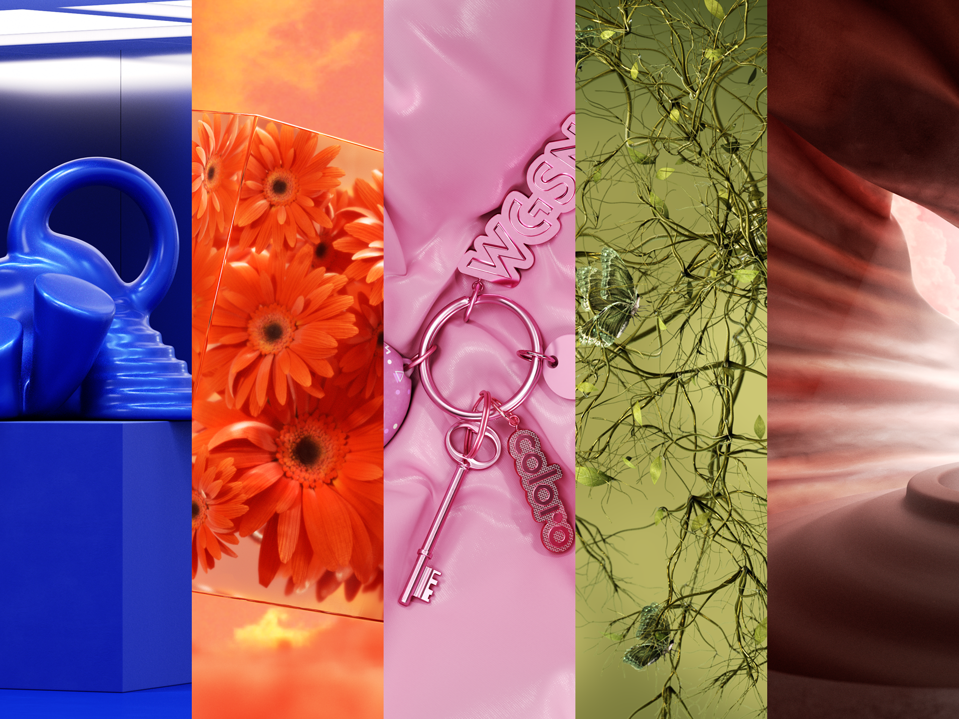
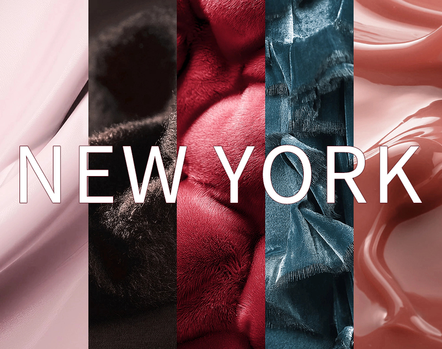
Key Colors for SS 27
Please explore the new key colors of WGSN SS 27. The following five colors will set the tone for the season and have a certain impact on the color application of celluloid sheets.
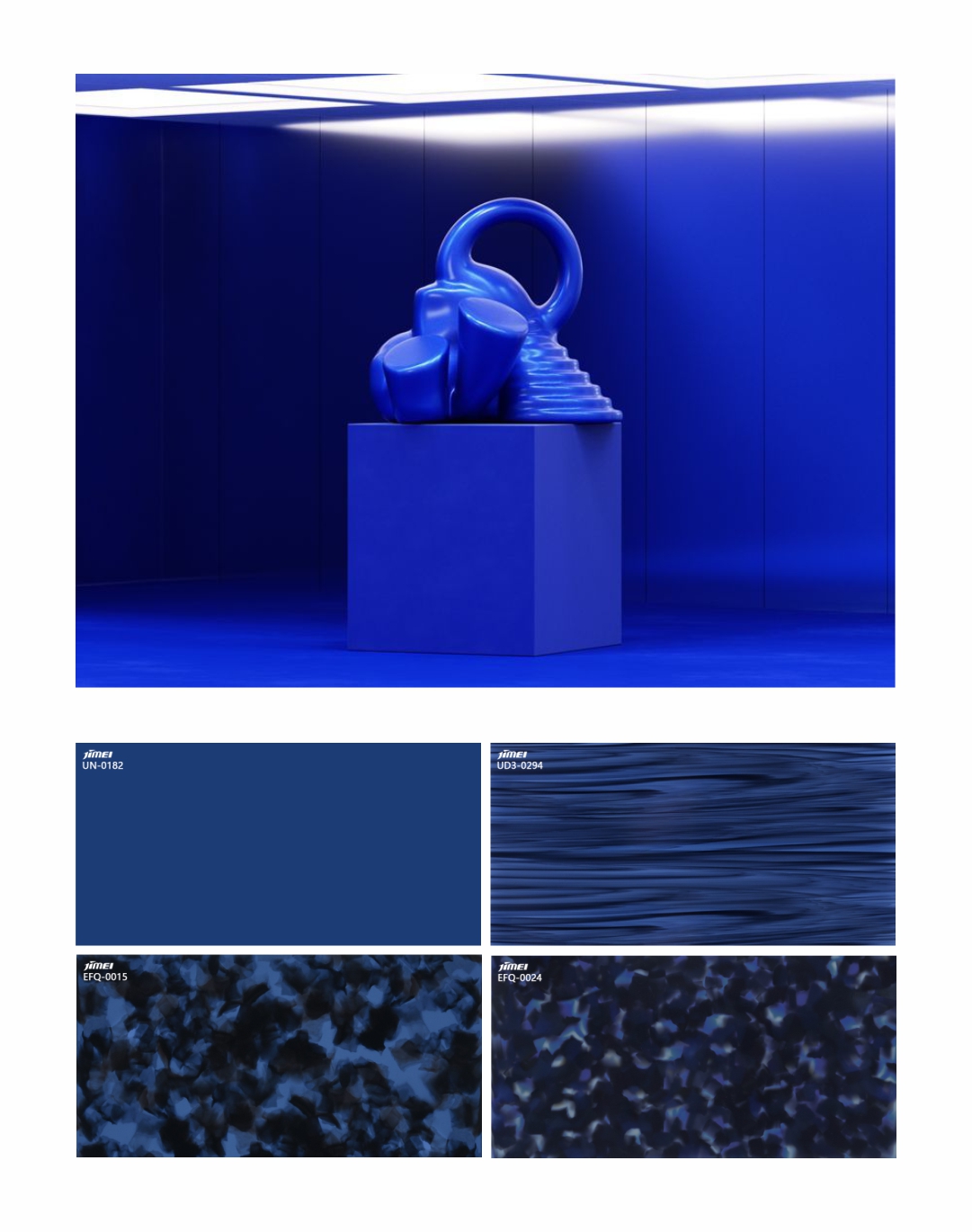
Luminous Blue
PANTONE 19-3952 TCX
Use Luminous Blue – our Colour of the Year 2027 – to connect the past with the future: this powerful blue connects traditional craft and dyeing techniques with technological AI innovation and digital craft.
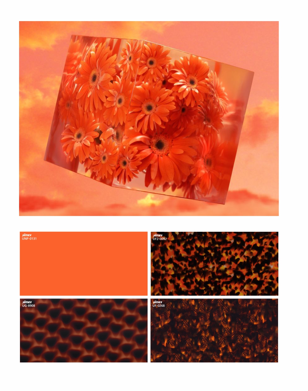
Energy Orange
PANTONE 16-1362 TCX
Apply Energy Orange to convey feelings of optimism and confidence: this vivid orange and other colours with positive emotional links will be vital in uncertain times.
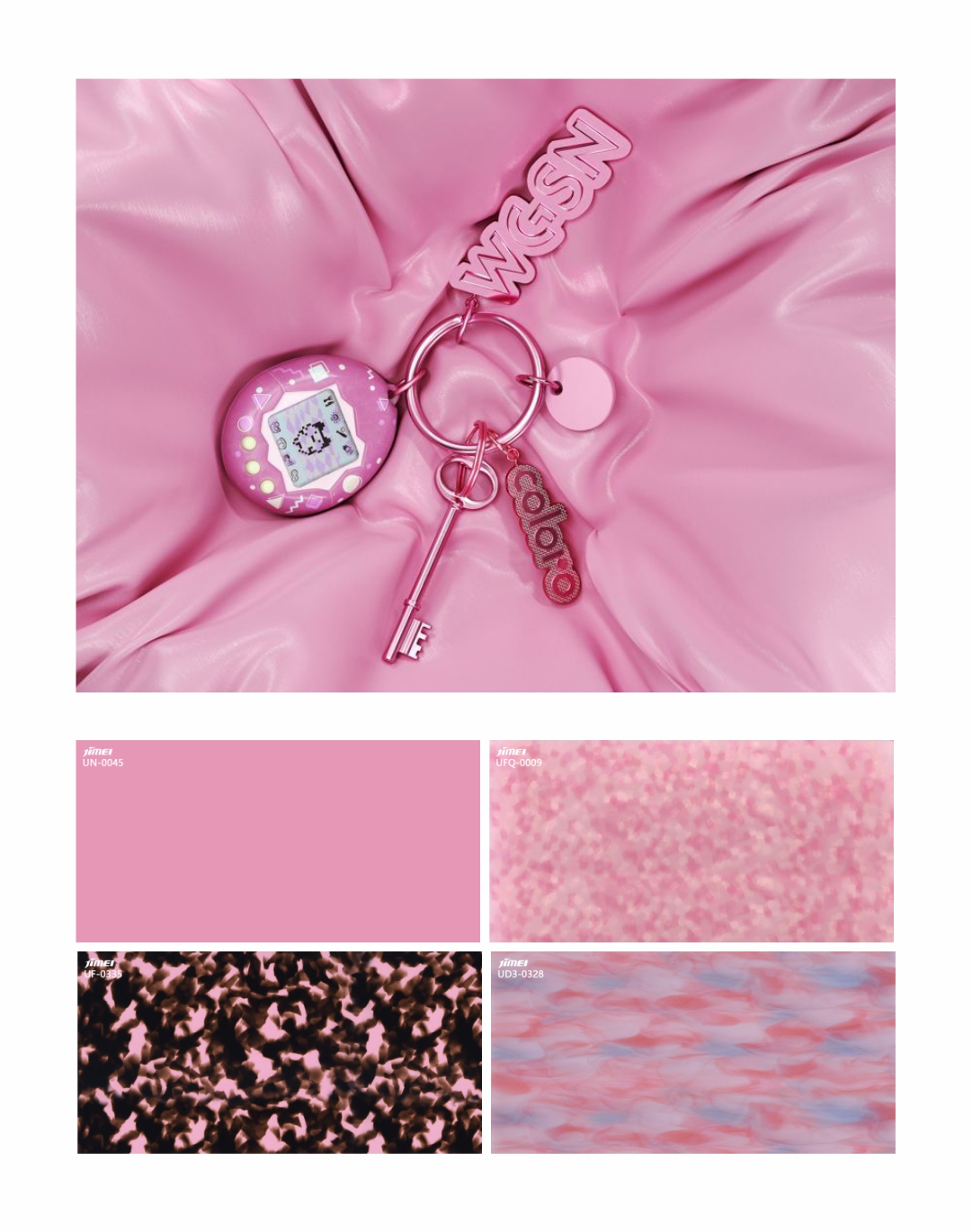
Pop Pink
PANTONE 15-2215 TCX
Amplify playfulness with Pop Pink: use this playful pink hue to create products that encourage fun (both serious and unserious), enjoyable wellness and analogue amusements.
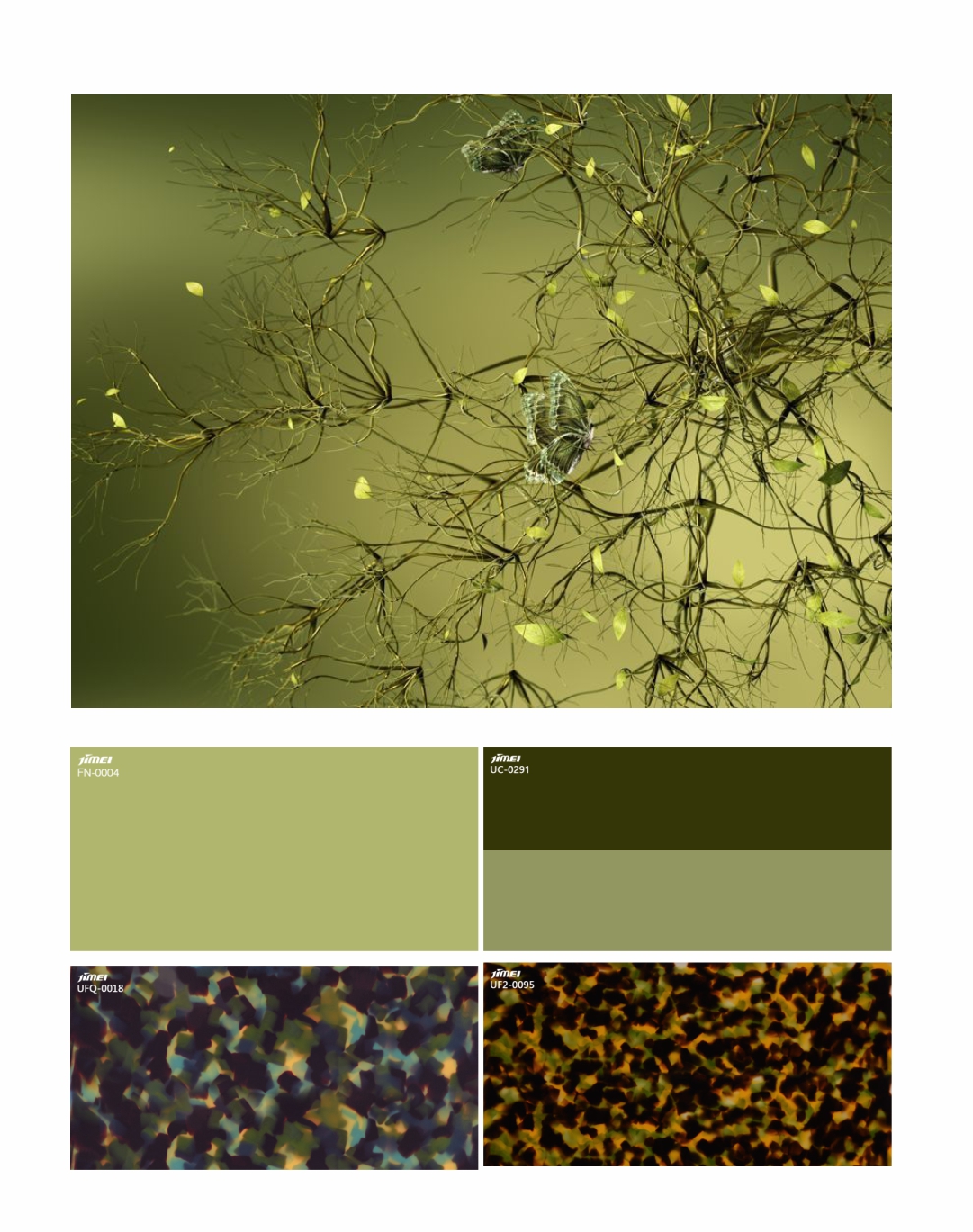
Meadowland Green
PANTONE 16-0532 TCX
Invest in Meadowland Green to promote rest and tranquillity: this nurturing green has a carefree appeal that aligns with themes of community and connecting to nature.
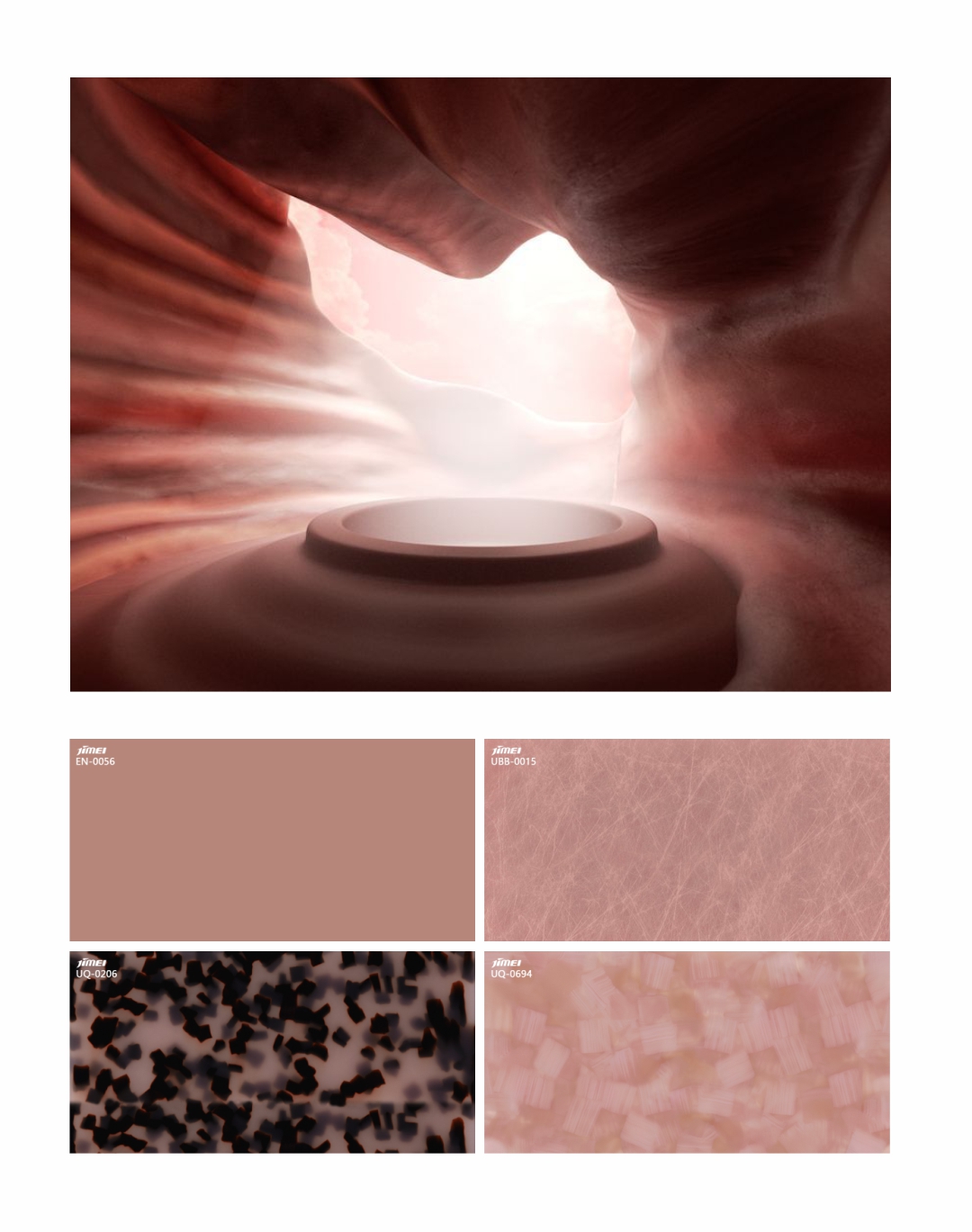
Clay
PANTONE 16-1516 TCX
Emphasise texture and form with the grounding neutral of Clay: this key neutral has an earthy, tactile quality that makes it especially appealing in the digital age.
.jpg)