When quiet classics meet bold visual energy, the AW 27/28 palette takes on a whole new attitude. The mood shifts from inward to outward and is redefined — from retro reworked and the pulse of digital life to a return to primal energy and immersive sensory narratives. Between sharp, deconstructed order and warm, human softness, it builds a visual bridge to the future.
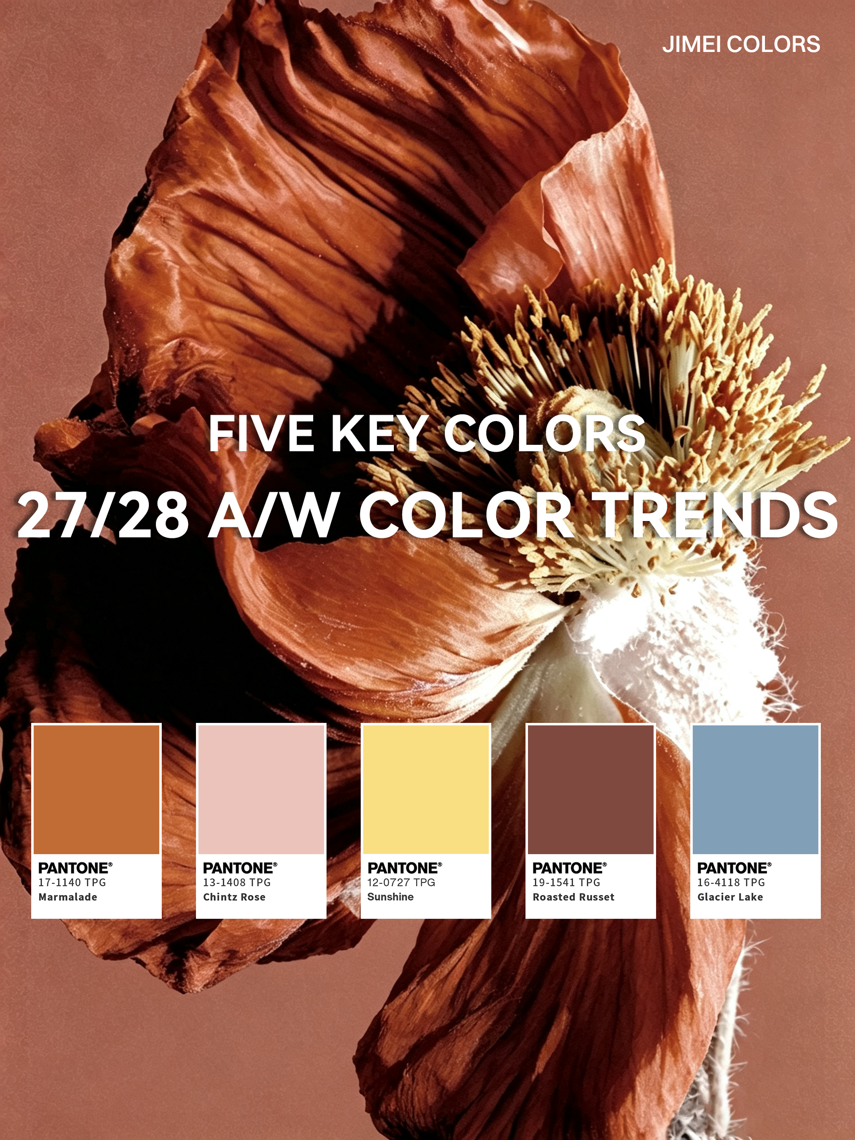
Here, JIMEI unveils POP's five key colours of the season — each one carrying its own mood and story. Ready to refresh your colour inspiration?
01

— Acetate Colours & an Inspiration Gallery —
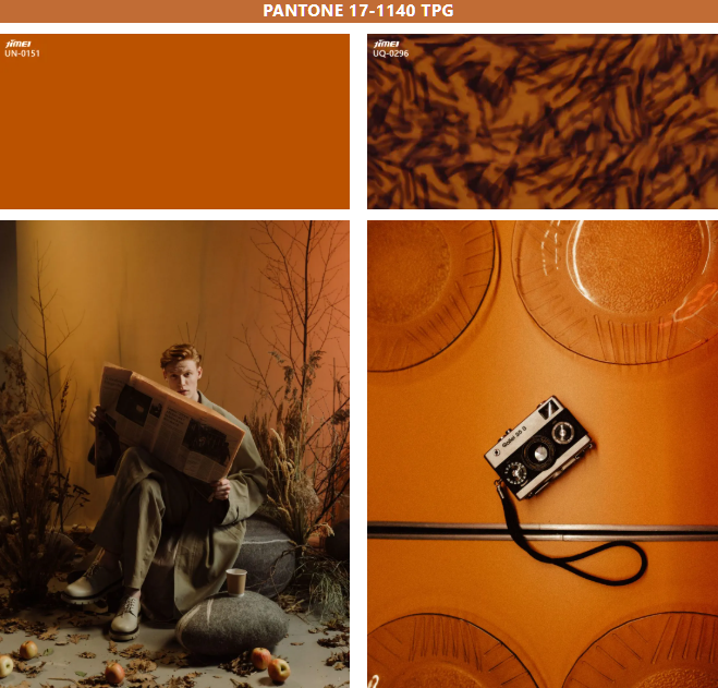
— From retro glamour to digital calm —
02

— Acetate Colours & an Inspiration Gallery —
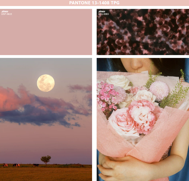
— Powdery softness, lighting the way to vivid energy —
03

— Acetate Colours & an Inspiration Gallery —
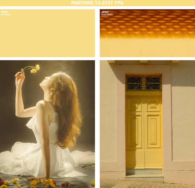
— From vivid energy to earthy originals —
04

— Acetate Colours & an Inspiration Gallery —
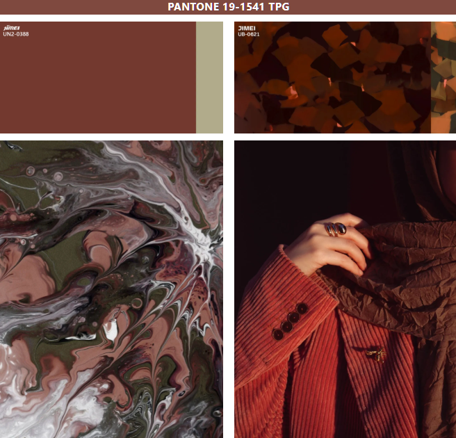
— Earthy textures, settling into quiet cool —
05

— Acetate Colours & an Inspiration Gallery —
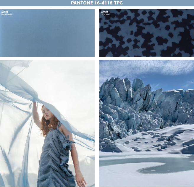
So — which one would you pick?
Five key colours, five moods.
From retro Marmalade to the quiet storytelling of Glacier Lake —
this season, let colour speak for you.